Or: How to Make Your UI Breathe With CSS Variables (No Framework Required)
Remember our journey through CSS Variables as Design Tokens and how Angular Material finally got with the program? Well, grab your favorite caffeinated beverage because we’re about to solve one of UI development’s most annoying problems: making interfaces that work for everyone.

> 🎯 Framework Agnostic Alert: This works with React, Vue, Angular, vanilla JS, or whatever framework your team picked this week. We’re using the web platform itself, so it’s basically future-proof! I will relate to the way Angular Material handles density in themes mainly because I know this framework best compared to others.
Ever squinted at a cramped interface thinking “I need reading glasses,” or stared at a spacious UI wondering “where did all the content go?” Welcome to the density problem. Most design systems treat density like a tattoo — pick once at build time, live with it forever, and pray your users don’t revolt.
But what if users could adjust their interface density like they adjust font size? What if “compact” vs “spacious” wasn’t your decision but *their* preference? What if density changes were smoother than a well-tuned espresso machine?
Spoiler alert: they can, and we’re about to build it.
The Density Problem: Why One Size Doesn’t Fit All
Picture this all-too-familiar scenario: You’re building a data-heavy dashboard (because of course you are). Your product manager wants it “compact” because “power users love seeing ALL THE DATA.” Your UX designer wants it “spacious” because “accessibility matters and people have fingers, not toothpicks.” Your users? Half are on 13-inch laptops squinting at everything, while the others have ultrawide monitors that could display a small movie theater.
Meanwhile, you’re stuck in the middle playing design diplomat, knowing that whatever you choose will make someone unhappy. Sound familiar?
The Traditional (Painful) Approach
Most design systems handle density like choosing a tattoo — permanent, painful to change, and you’ll probably regret it:
// 😤 The old way: Pick your poison and rebuild when you're wrong
@if $density == 'compact' {
  .component {
    height: 32px;
    padding: 4px 8px;
  }
} @else if $density == 'normal' {
  .component {
    height: 40px;
    padding: 8px 12px;
  }
} @else if $density == 'loose' {
  .component {
    height: 48px;
    padding: 12px 16px;
  }
}This approach has more problems than a Monday morning standup:
- 🔒 Build-time prison: Want to change density? Hope you like rebuilding!
- 👥 Democracy fail: All users get whatever you decided at 2 AM
- 📱 Device blindness: No adaptation for different screen sizes
- ♿ Accessibility oops: Users can’t adjust for their individual needs
- 🎨 A/B testing nightmare: Want to test different densities? Good luck!
The CSS Variables Plot Twist
Remember those CSS custom properties from our design tokens adventure? They’re about to become the hero of this story, but with a twist we haven’t used before: mathematical calculations right inside CSS.
/* 🚀 The "why didn't we always do this?" approach */
:root {
  --density-factor: 0; /* User controls this! */
  --component-height: calc(40px + var(--density-factor) * 4px);
  --component-padding: calc(8px + var(--density-factor) * 2px);
}

.component {
  height: var(--component-height);
  padding: var(--component-padding);
  transition: all 0.3s ease; /* Because jarring changes are so 2010 */
}And now for the magic trick — changing density across your entire app:
// *waves CSS variable wand*
document.documentElement.style.setProperty('--density-factor', '-2'); // Compact
document.documentElement.style.setProperty('--density-factor', '2');  // Loose
// No rebuilding, no page refreshes, no tearsUnderstanding Density: It’s Not Just Size, It’s Psychology
Density is really about how much information vs how much comfort your users want:
- Compact Crusaders (-2): “Show me ALL the data. I have eagle eyes and zero patience.”
- Normal Folks (0): “I want efficiency without squinting, thank you very much.”
- Loose Lovers (+2): “I have human-sized fingers and appreciate breathing room.”
Each density level tells a story about your user’s context — their device, eyesight, task urgency, and personal preferences.
The Density Spectrum in Action
Here’s what each density looks like in practice:
<!DOCTYPE html>
<html>
<head>
  <style>
    :root {
      --density-factor: 0;
      --component-height: calc(40px + var(--density-factor) * 4px);
      --component-padding: calc(8px + var(--density-factor) * 2px);
    }

    .demo-card {
      height: var(--component-height);
      padding: var(--component-padding);
      margin: 8px;
      background: #f0f0f0;
      border-radius: 4px;
      transition: all 0.3s ease;
      display: flex;
      align-items: center;
    }
  </style>
</head>
<body>
  <label>Choose your density adventure:</label>
  <select id="densityPicker">
    <option value="-2">Compact (32px buttons)</option>
    <option value="0" selected>Normal (40px buttons)</option>
    <option value="2">Loose (48px buttons)</option>
  </select>

  <div class="demo-card">Watch me resize! 🎛️</div>
  <div class="demo-card">I resize too! ✨</div>
</body>
</html>Pro tip: You can go more extreme with -3 to +3, but these three hit the sweet spots for most users. If you need more fine grained control you can define a smaller increment. I personally think 3 options might be the sweet spot.
Building Your Density System (The Fun Part!)
Ready to build something that’ll make your users actually thank you? Let’s create a density system so simple, you’ll wonder why everyone makes this complicated.
The “Holy Trinity” of Density
/* Literally just 3 lines. That's it. */
:root {
  --density-factor: 0; /* The magic number users control */
  --component-height: calc(40px + var(--density-factor) * 4px);
  --component-padding: calc(8px + var(--density-factor) * 2px);
}Any component can use these density-aware properties:
/* Button - uses density for height and padding */
.my-button {
  height: var(--component-height);
  padding: 0 var(--component-padding);
  transition: all 0.3s ease;
}

/* Card - uses density for internal spacing */
.my-card {
  padding: var(--component-padding);
  transition: padding 0.3s ease;
}

/* That's it! Components automatically adapt to density changes */Adding the Control Panel (AKA: Let Users Drive)
Now for the JavaScript that makes this whole thing actually work:
// The world's simplest density manager
class DensityManager {
  constructor() {
    // Load user's preference (because we're thoughtful like that)
    this.currentDensity = parseInt(localStorage.getItem('density-preference')) || 0;
    this.applyDensity(this.currentDensity);
  }

  setDensity(density) {
    // Update everywhere at once (CSS variables are magic)
    document.documentElement.style.setProperty('--density-factor', density);
    localStorage.setItem('density-preference', density);
    this.currentDensity = density;
  }

  applyDensity(density) {
    document.documentElement.style.setProperty('--density-factor', density);
  }
}

// That's it. Seriously.
const densityManager = new DensityManager();
densityManager.setDensity(-2); // "Make it compact!"
densityManager.setDensity(2); // "Give me space!"Why This Approach Is Actually Amazing
- 🚀 Instant Gratification: Changes happen immediately. No rebuilds, no “please wait while we deploy your button size preference.”
- 🌍 Universal Compatibility: Works with React, Vue, Angular, or that weird framework your startup insists on using.
- 🧠 User Empowerment: People can adjust their interface for their needs. Revolutionary concept, right?
- ✨ Smooth as Butter: CSS transitions make density changes feel intentional, not jarring.
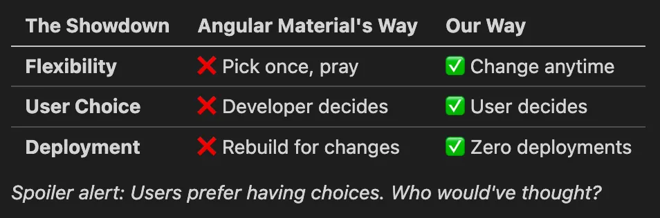
The Great Density Face-Off: Build-Time vs Runtime
Angular Material’s approach: “Pick your density and live with it forever”
// The commitment-phobic developer's nightmare
$theme: mat.define-theme((
  density: (scale: -2)  // Hope you chose wisely!
));Our approach: “Let users decide what works for them”
/* The "customer is always right" approach */
:root {
  --density-factor: 0; /* Users control this */
  --component-height: calc(40px + var(--density-factor) * 4px);
}
The Angular Alternative: Multiple Themes (And What It Costs)
“But wait,” says the Angular developer, ”I can create multiple themes with different densities and switch between them!”
You absolutely can. Here’s how:
// Create multiple themes with same colors, different densities
$compact-theme: mat.define-theme((
  color: (primary: mat.$violet-palette),
  density: (scale: -2)
));

$normal-theme: mat.define-theme((
  color: (primary: mat.$violet-palette),
  density: (scale: 0)
));

$loose-theme: mat.define-theme((
  color: (primary: mat.$violet-palette),
  density: (scale: 2)
));

// Include all themes in your CSS
@include mat.all-component-themes($compact-theme);
.loose-theme { @include mat.all-component-themes($loose-theme); }
.normal-theme { @include mat.all-component-themes($normal-theme); }
// Switch themes at runtime
toggleDensity(density: string) {
document.body.className = `${density}-theme`;
}The Hidden Costs
This approach works, but comes with some serious baggage:
📦 Bundle Size Explosion**: Each theme generates complete CSS for every Material component
- Single density: ~150KB of Material CSS
- Three densities: ~450KB of Material CSS
- Math: Linear growth = 3x the CSS payload (Yes, you could try to lazy load only what is needed)
🔄 CSS Switching Overhead: Browser has to:
- Parse and store multiple complete stylesheets
- Invalidate existing styles when switching
- Recalculate layout for the entire page
Our CSS variables approach:
- Bundle size: Same 150KB regardless of density options
- Switching cost: Change one CSS variable, browser handles the rest
- Maintenance: One theme definition, infinite density variations
Bottom line: Angular’s multi-theme approach works but costs you bundle size and complexity. Our approach gives you the same runtime flexibility with zero CSS bloat.
Performance Reality Check: Is This Actually Fast?
TL;DR: Yes. CSS custom properties and `calc()` are native browser features, optimized for over a decade.
CSS custom properties aren’t like JavaScript variables — they’re compiled by the browser’s CSS engine and only recompute when values actually change. Modern browsers handle `calc()` functions efficiently as part of their native rendering pipeline.
When to actually worry about performance:
- Massive data tables (1000+ rows): Consider virtualization regardless of density approach
- Complex nested calculations: Keep `calc()` expressions simple when possible
/* ✅ Simple and fast */
height: calc(40px + var(--density-factor) * 4px);

/* ⚠️ More complex - use sparingly */
height: calc(calc(40px + var(--density-factor) * 4px) + var(--extra-spacing));Bottom line: This approach outperforms JavaScript-based solutions and your performance budget is safe.
Common Gotchas (Or: How to Avoid Making Me Sad)
Even with this simple approach, there are a few ways to shoot yourself in the foot. Let’s avoid those:
1. The “Invisible Button” Problem
/* ❌ DON'T: Create buttons smaller than a grain of rice */
.button {
  height: calc(20px + var(--density-factor) * 4px); /* Could be 12px! */
}

/* ✅ DO: Set reasonable minimums (users need to actually click these) */
.button {
  height: max(32px, calc(40px + var(--density-factor) * 4px));
}2. Inconsistent Density Factors
/* ❌ BAD - Different multipliers everywhere */
.button { height: calc(40px + var(--density-factor) * 4px); }
.input { height: calc(36px + var(--density-factor) * 3px); }
.card { padding: calc(16px + var(--density-factor) * 5px); }

/* ✅ BETTER - Consistent multipliers */
.button { height: calc(40px + var(--density-factor) * 4px); }
.input { height: calc(36px + var(--density-factor) * 4px); }
.card { padding: calc(16px + var(--density-factor) * 4px); }

/* ✅ BEST - Design tokens for consistency */
:root {
  --density-unit: calc(var(--density-factor) * 4px);
}

.button { height: calc(40px + var(--density-unit)); }
.input { height: calc(36px + var(--density-unit)); }
.card { padding: calc(16px + var(--density-unit)); }3. Missing Transitions
Without smooth transitions, density changes feel jarring:
/* ❌ BAD - Abrupt changes */
.component {
  height: var(--component-height);
}

/* ✅ GOOD - Smooth transitions */
.component {
  height: var(--component-height);
  transition: height 0.3s ease;
}Wrapping Up: You’ve Just Made UI History
Congratulations! You’ve just built something that’ll make your users actually *happy* with your interface:
- ✅ Works everywhere: React, Vue, Angular, vanilla JS, carrier pigeon
- ✅ Zero rebuilds: Changes happen instantly, like good coffee
- ✅ User empowerment: People can customize their experience
- ✅ Stupid simple: Three CSS variables and a few lines of JavaScript
While other developers are rebuilding entire apps to change button sizes, you’ll be sipping your coffee watching users adjust density in real-time.
Now go forth and give your users the density controls they never knew they needed. Your support tickets will thank you.
Keep making interfaces that don’t suck! 🎛️
This concludes my blog trilogy focused on design tokens. Curious what will come next 😉